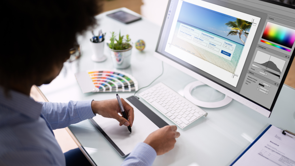
In the digital era, the importance of graphic web design can’t be overstated. It’s the silent ambassador of your brand, the visual voice that speaks volumes about your business. This article delves into the fascinating world of graphic web design, exploring its significance and impact on online presence.
From color schemes to typography, every element in web design plays a crucial role in shaping users’ experiences. It’s a blend of art and technology, a balance between aesthetics and functionality. As we navigate through this topic, you’ll gain insights into the techniques and trends shaping the future of web design.
So, whether you’re a seasoned designer or a curious novice, there’s something for everyone. Let’s embark on this journey together, unravelling the secrets behind creating captivating, user-friendly websites.
Graphic Web Design

In the world of the internet, graphic web design has seen significant transformations, enriched by technological advancements and emerging trends. This evolution manifests itself predominantly from the shift of Web 1.0 to Web 3.0, along with considerable influence by the advent of mobile devices.
Web 1.0, known as the “read-only” era, exhibited simple, static designs with a limited color palette. For instance, homepages like that of Yahoo! in the late 90s, with a text-based design and minimal graphics, marked this era. However, as technology evolved, Web 2.0, or the “read-write” phase, emerged. Designers started using brighter colors, gradients, and interactive features, promoting user-generated content. Websites like Facebook and YouTube belong to this era.
Subsequently, the transition to Web 3.0 or the “read-write-execute” phase saw the incorporation of artificial intelligence, 3D graphics, and motion design. Search engines like Google moved towards a minimalist interface offering a user-centric design, enhancing user experience significantly.
Impact of Mobile Devices on Design Trends
Mobile devices brought about a paradigm shift in graphic web design trends. With the increasing usage of smartphones, the need for responsive designs became paramount, leading to the rise of mobile-first design approach. Websites needed to fit on different screen sizes, demand for thumb-friendly navigation increased, and long-scrolling sites with easy accessibility became prevalent. Websites like Airbnb and Dropbox signify this trend, boasting user-friendly interfaces adjusted to various screen sizes. These changes underscored the importance of usability and accessibility in web design, taking precedence over purely aesthetic considerations.
Fundamental Principles of Graphic Web Design

Delving deeper into the realm of graphic web design, critical principles constantly shape design outcomes. These principles, like color psychology and layout or spatial relationships, play a prominent role in the overall perception and usability of a website.
Color, more than a mere decorative element, serves as a powerful communication tool in the design field. Digital designers command the concept of color psychology, intentionally using color to trigger specific emotional responses in users.
Layout and Spatial Relationships
Layout is another essential factor, often defining the first impression of a webpage. Alongside color, fonts, and images, the layout forms the site’s overall aesthetic, directly influencing usability. A well-structured layout, marked by thoughtful spatial relationships between elements, ensures a seamless user journey with consistent navigability. Striking a balance between aesthetic appeal and functionality, a clean and intuitive layout typically leads to decreased bounce rates and increased user engagement.
Key Challenges in Graphic Web Design

Graphic web design is indisputably vital, but it comes with its unique set of challenges. Each graphic design issue necessitates a focused, strategic solution.
One crucial hurdle in graphic web design is ensuring cross-platform compatibility. Designs may often look good on one operating system or device but distort on others. Given the multitude of devices, screen resolutions, and operating systems in use today, designers struggle to create layouts that are universally compatible. Tools like Webflow and Gravit Designer, mentioned earlier, offer cross-platform support, thus addressing this problem. However, they cannot eliminate the challenge in its entirety. Testing designs across various platforms, devices, and browsers becomes an imperative part of the design process to ensure consistency and efficiency.

